- Branding
- | UX Design
- | Research
Yaan.store is a marketplace that simplifies the non-profit fundraising process, where artists and craft-makers list their products and make them available for charities.
Through Yaan a hidden economy can be unlocked through matching needs that are complementary one to another: charities in need to sell products in order to raise funds, and makers who produce goods that are usually given away to friends and family or take up space in their houses. Such an economy can be brought forth to a mainstream market and creates opportunities.
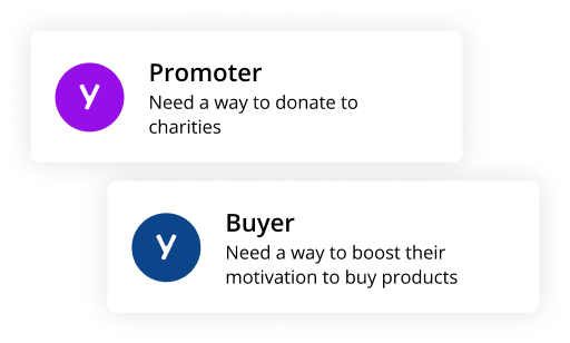
Motivated by the opportunity to gain exposure, to have their products reach a wider audience, and to see their creations contribute positively to a cause they align with: we gave them a tool to list their products, connect with charities, and support a good cause with their art.
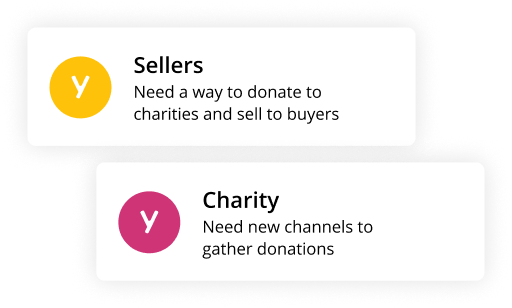
Motivated to reach a larger audience, build a stronger community, and streamline their fundraising efforts. Typically lack the resources or infrastructure to produce, market, or sell products at scale: we facilitated their fundraising efforts by selling unique products from crafters, that align with their mission and attract donors.
We utilised empathy maps to gain a deeper understanding of our two primary user groups: Charities and Crafters. By mapping out what these users think, feel, say, and do, we were able to gain rich insights into their motivations, pain points, and needs, helping us to design with greater empathy and user understanding.
User stories helped us to visualize the specific actions that Charities and Crafters want to accomplish on the Yaan store platform.
The Jobs to be Done framework further assisted in defining the core tasks that our users are trying to accomplish.
Semantical Difference: We analysed variations in how different users interpret and understand the information and interactions on Yaan platform, designed in a way that is intuitive, meaningful, and satisfying for both user groups. This included considering how each user group might interpret different terminology, iconography, and navigation structures, and designing with these differences in mind.
Competitive Analysis: The competitive analysis involved identifying and evaluating similar platforms that either cater to charities looking to fundraise or platforms that support crafters in selling their products. By mapping these competitors on a matrix based on factors such as ease of use, features, and target audience, we were able to identify gaps in the market and unique opportunities for Yaan.store

For instance, we noticed that while many platforms catered to either crafters (like Etsy) or charities (like GoFundMe), few effectively bridged the gap between these two user groups. This presented a unique opportunity for Yaan.store to position itself as a platform that not only supports crafters in selling their products and charities in fundraising, but also promotes a strong sense of community and social impact.
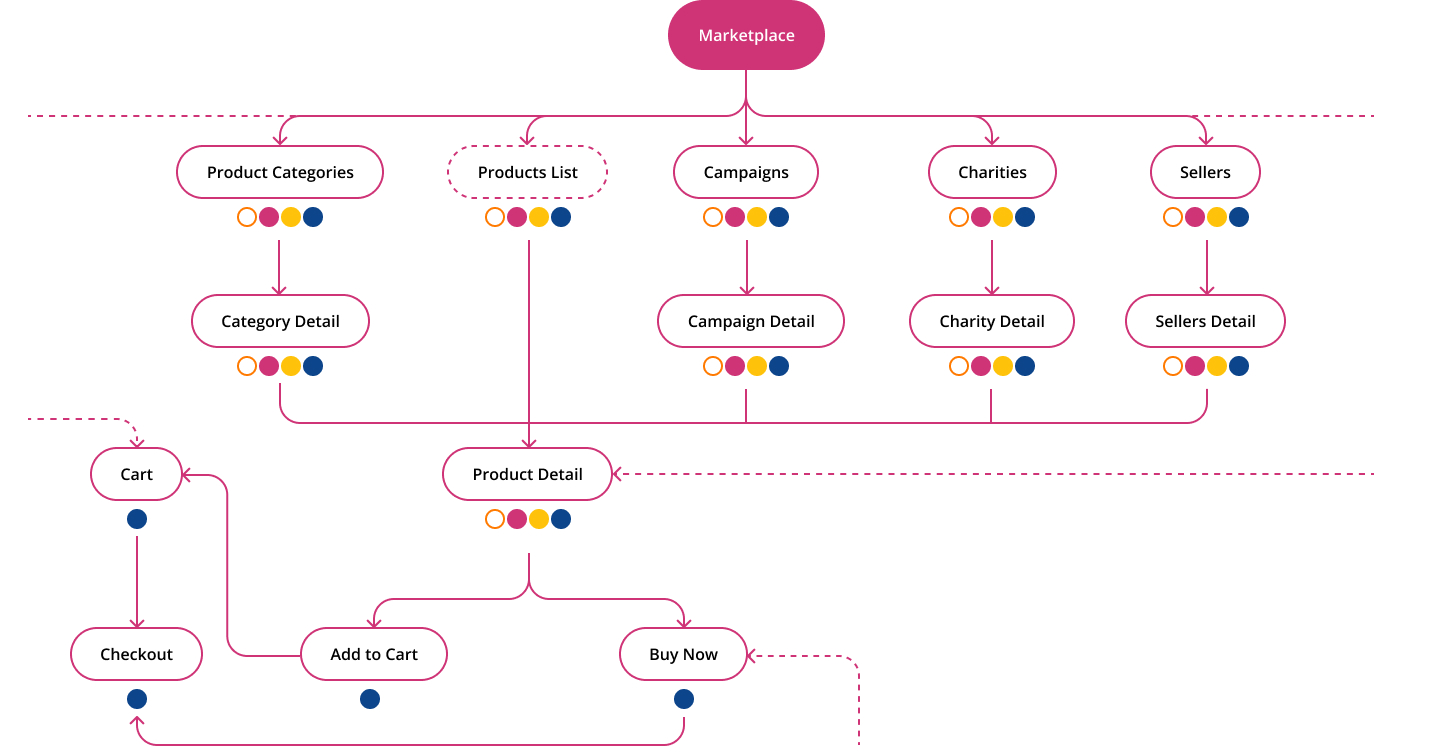
The development of the IA also involved establishing a clear and consistent taxonomy. Taxonomy refers to the system of classification used on the site, including categories, tags, and labels.
The name “Yaan” is a clever contraction of “Yarn,” which directly relates to crafting, one of the central themes of the platform. Additionally, the phrase “Spin a yarn” carries the connotation of telling a story, which mirrors the brand’s mission to tell the stories of both crafters and charities. The name successfully conveys the brand’s dedication to connecting crafts and causes, while also inviting users to partake in a story-rich experience.
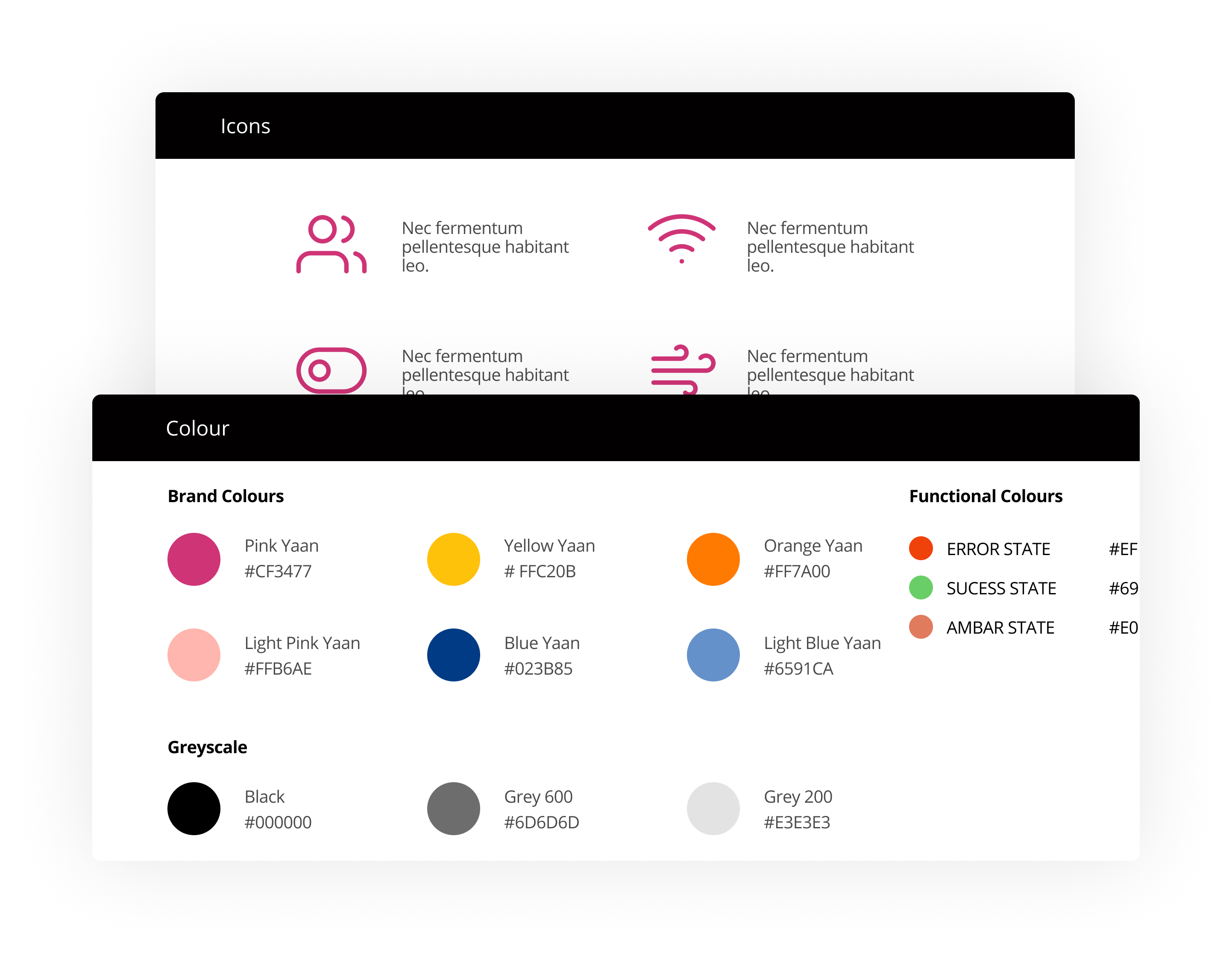
A rounded logo shape often symbolizes unity, community, and completeness. It suggests a friendly, approachable brand that values connection and inclusivity

The warm color palette of the logo resonates with feelings of passion, energy, and comfort – characteristics that are often associated with both crafting and supporting worthy causes. Warm colors can evoke feelings of happiness and optimism and can also symbolize creativity and warmth, reinforcing the brand’s identity as
Wreating a library of reusable components for displaying product listings and charity profiles; navigation modules that help users move through the site easily, including headers, footers, and sidebars; feedback and interactive modules. Those components were mixed, matched, and reused across different pages and contexts, ensuring consistency and improving efficiency in design and development.
The modular design also allows for easier updates and maintenance since changes to a module automatically apples wherever that module is used.
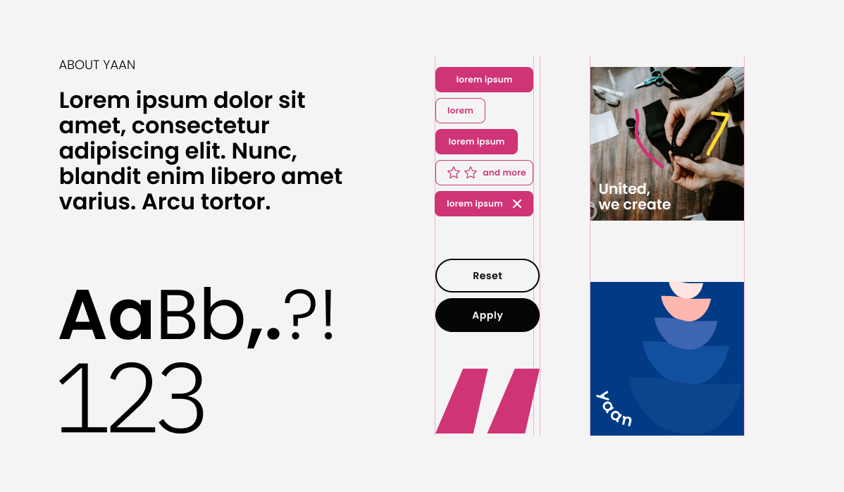
On Yaan.store, illustrations are used strategically to identify different sections, guide users, and establish the brand’s visual language.


An early UI design played a crucial role in enabling the product owner to build the platform using a no-code design approach.
Developed as part of the UX design phase, the Early UI provided a blueprint to follow when building the platform: the product owner was able to ‘assemble’ the platform like a jigsaw puzzle, dragging and dropping the pre-defined modules into place as per the design.
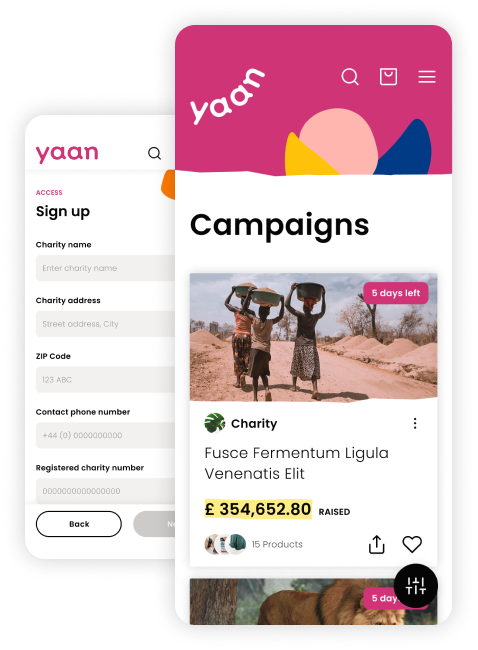
The combination of a clear, well-designed early UI and a no-code platform facilitated a smooth, efficient, and effective build process for Yaan.store, making it a powerful example of modern, user-centered digital product development.
